 你我学习网
你我学习网
微信小程序组件cover-view
基础库 1.4.0 开始支持,低版本需做兼容处理。
覆盖在原生组件之上的文本视图。
可覆盖的原生组件包括 map、video、canvas、camera、live-player、live-pusher
只支持嵌套 cover-view、cover-image,可在 cover-view 中使用 button。组件属性的长度单位默认为px,2.4.0起支持传入单位(rpx/px)。
| 属性 | 类型 | 默认值 | 必填 | 说明 | 最低版本 |
|---|---|---|---|---|---|
| scroll-top | number/string | 否 | 设置顶部滚动偏移量,仅在设置了 overflow-y: scroll 成为滚动元素后生效 | 2.1.0 |
Bug & Tip
tip: cover-view和cover-image的aria-role仅可设置为button,读屏模式下才可以点击,并朗读出“按钮”;为空时可以聚焦,但不可点击tip: 基础库 2.2.4 起支持 touch 相关事件,也可使用 hover-class 设置点击态tip: 基础库 2.1.0 起支持设置scalerotate的 css 样式,包括 transition 动画tip: 基础库 1.9.90 起cover-view支持overflow: scroll,但不支持动态更新overflowtip: 基础库 1.9.90 起最外层cover-view支持position: fixedtip: 基础库 1.9.0 起支持插在view等标签下。在此之前只可嵌套在原生组件map、video、canvas、camera内,避免嵌套在其他组件内。tip: 基础库 1.6.0 起支持css transition动画,transition-property只支持transform (translateX, translateY)与opacity。tip: 基础库 1.6.0 起支持css opacity。tip: 事件模型遵循冒泡模型,但不会冒泡到原生组件。tip: 文本建议都套上cover-view标签,避免排版错误。tip: 只支持基本的定位、布局、文本样式。不支持设置单边的border、background-image、shadow、overflow: visible等。tip: 建议子节点不要溢出父节点tip: 支持使用 z-index 控制层级tip: 默认设置的样式有:white-space: nowrap;line-height: 1.2;display: block;bug: 自定义组件嵌套cover-view时,自定义组件的 slot 及其父节点暂不支持通过 wx:if 控制显隐,否则会导致cover-view不显示
示例代码
JS:
Page({
  onShareAppMessage() {
    return {
      title: 'cover-view',
      path: 'page/component/pages/cover-view/cover-view'
    }
  },

  data: {
    latitude: 23.099994,
    longitude: 113.324520,
  }
})
WXML:
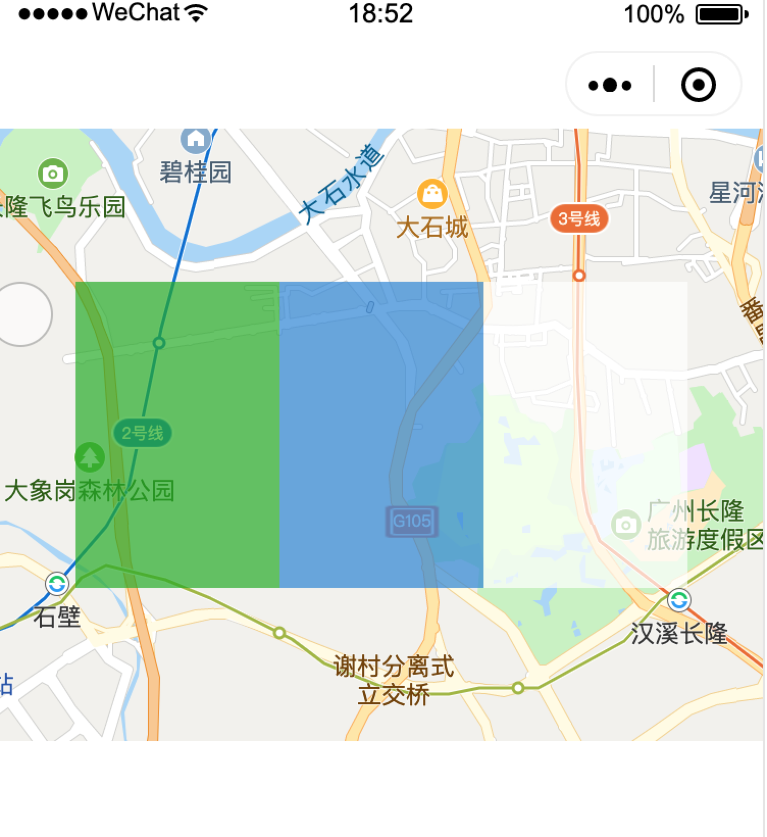
<view class="container">
  <view class="page-body">
    <view class="page-section page-section-gap">
      <map
        style="width: 100%; height: 300px;"
        latitude="{{latitude}}"
        longitude="{{longitude}}"
      >
        <cover-view class="cover-view">
          <cover-view class="container">
            <cover-view class="flex-wrp" style="flex-direction:row;">
              <cover-view class="flex-item demo-text-1"></cover-view>
              <cover-view class="flex-item demo-text-2"></cover-view>
              <cover-view class="flex-item demo-text-3"></cover-view>
            </cover-view>
          </cover-view>
        </cover-view>
      </map>
    </view>
  </view>
</view>
WXSS:
.cover-view {
  position: absolute;
  top: calc(50% - 150rpx);
  left: calc(50% - 300rpx);
  /* opacity: .7; */
}

.flex-wrp{
  display:flex;
}

.flex-item{
  width: 200rpx;
  height: 300rpx;
  font-size: 26rpx;
}

.demo-text-1 {
  background: rgba(26, 173, 25, 0.7);
}

.demo-text-2 {
  background: rgba(39, 130, 215, 0.7);
}

.demo-text-3 {
  background: rgba(255, 255, 255, 0.7);
}